Click to view code
pacman::p_load(ggrepel, patchwork, ggthemes,
hrbrthemes, tidyverse, ggplot2)Zou Jiaxun
April 20, 2024
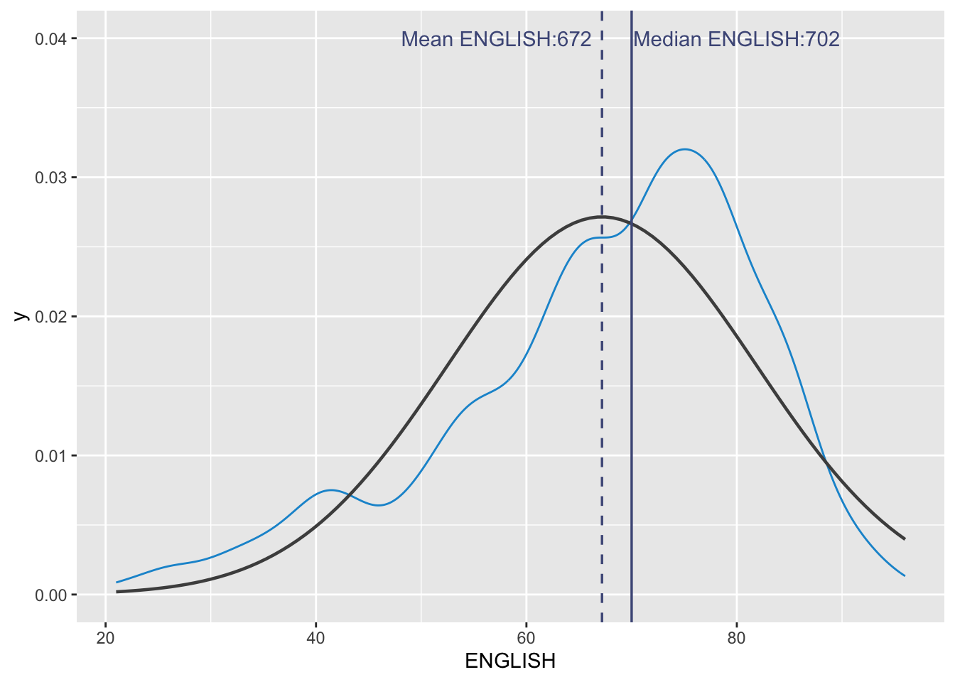
median_eng <- median(exam_df$ENGLISH)
mean_eng <- mean(exam_df$ENGLISH)
std_eng <- sd(exam_df$ENGLISH)

ggplot(exam_df, aes(x=ENGLISH)) +
  geom_density(color = "#1696d2",
               adjust = 0.65,
               alpha = 0.6,) +
  stat_function(
    fun=dnorm,
    args = list(mean=mean_eng, sd = std_eng),
    col = "grey30",
    size = 0.8)+
    geom_vline(aes(xintercept=mean_eng), color = "#4d5887", linewidth = 0.6, linetype = "dashed")+
  annotate(geom = "text",
           x = mean_eng - 10,
           y = 0.04,
           label = paste0("Mean ENGLISH:", round(mean_eng), 2),
           color = "#4d5887") +
  geom_vline(aes(xintercept=median_eng), color = "#4d5887", linewidth = 0.6) +
  annotate(geom = "text",
           x = median_eng + 10,
           y = 0.04,
           label = paste0("Median ENGLISH:", round(median_eng), 2),
           color = "#4d5887")
Ridgeline plot (sometimes called Joyplot) is a data visualisation technique for revealing the distribution of a numeric value for several groups. Distribution can be represented using histograms or density plots, all aligned to the same horizontal scale and presented with a slight overlap.
It makes sense for distributions with 5 or more groups.
ggridges package provides two main geom to plot gridgeline plots, they are: geom_ridgeline()and geom_density_ridges().
geom_ridgeline() plots the graph using the height values from the data directly. It is useful when the height values refer to a column directly.
For this particular dataset, it is more appropriate to use geom_density_ridges() as we need to plot the distribution of students’ English score. If we had tallied and aggregated the number of students who scores within score ranges, geom_ridgeline() might be appropriate but it isn’t the case.
# ggplot(exam_df,
#        aes(x = ENGLISH,
#            y = CLASS)) +
#   geom_density_ridges(
#     scale = 3,
#     rel_min_height = 0.01,
#     bandwidth = 3.4,
#     fill = lighten("#7097BB", .3),
#     color = "white"
#   ) +
#   scale_x_continuous(
#     name = "English grades",
#     expand = c(0, 0)
#     ) +
#   scale_y_discrete(name = NULL, expand = expansion(add = c(0.2, 2.6))) +
#   theme_ridges()